The Categorization tab is useful for reviewing detailed information from documents. On this tab, you must first select the desired level and template before any data becomes visible. The charts on this tab rely heavily on filters, and their names correspond directly to the filter names
In addition to the filter selections at the top, this tab allows you to create new filter selections directly from the charts by clicking a value. That value is then applied as a filter. Selected values can be cleared the same way as other filters—either using the Clear filters button at the top or individually from each filter row.
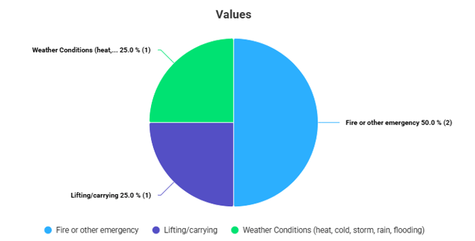
Values
The first chart lists all values contained in the selected templates.
You can use the Filter values function to display only the values you want.
In the example image, only the values corresponding to the “observation classification” question have been filtered into view
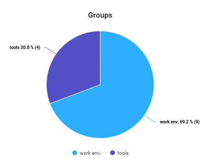
Groups
This chart is best suited for reviewing data from checklists. It allows you to examine the groups that are reviewed in checklists and updatable checklists. For forms, the chart lists the names of the tools.
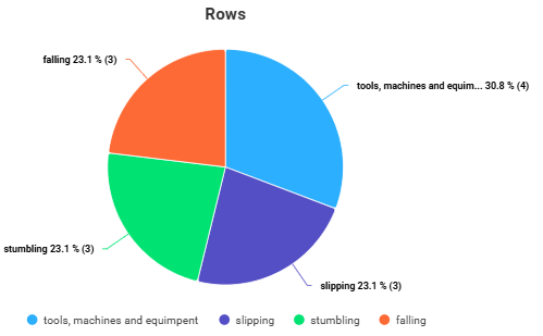
Rows
This chart is also best suited for reviewing data from checklists. It allows you to examine the checklists under each group as well as the updatable checklist items—i.e., the rows of the checklist. For forms, the chart lists the names of the tools.
Selections made in the Groups filter have a particular impact on the content of this chart.
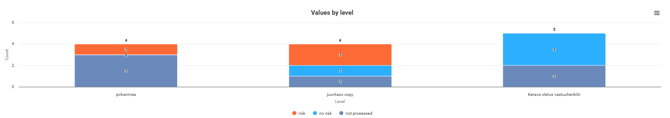
Values by Level
This chart lists the values from the first chart, broken down by level. Each value is assigned its own colour, which remains consistent across all levels. The total amount of values for each level is displayed above the level bar.
Additional details can be viewed by hovering the cursor over each section.
Values by Time
This chart lists the values from the first chart by time period. The time scale can be changed using the time filters if the initial view is not at the desired level of detail. Each value has its own colour, which remains consistent across all time periods. The total number of values for each period is shown above its bar.
Additional details can be viewed by hovering the cursor over each section.
Printing and Saving Charts
In the Analytics view, charts can be accessed through the three-line icon in the top-right corner of each chart. The dropdown menu allows you to open the chart in a new window or save it in the desired file format.