.png?width=100&height=35&name=Kiwa_2024_RGB%20(1).png)
Title: Add a subheading to the tool, which allows you to periodize the tool.
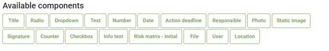
Radio: The component allows you to add predefined options to the tool, such as yes/no. The tool also allows you to set colors for the radio buttons. Color options for the radio button and their properties:
- Green = Color only, does not generate a task or affect the index.
- Red = Color only, does not create a task or affect the index.
- Blue = Color only, does not create a task or affect the index.
- Orange = Color only, does not generate a task or affect the index.
- Task = Create task. Does not affect the index.
- Positive = Affects the index generated by the tool. Adds one positive value to the index.
- Negative = Affects the index generated by the tool. Adds one negative value to the index.
For example, the selection buttons can be OK - green, not verified - blue and Not OK - red. In this case, when clicking on the option not OK, it will turn red, and this option will be selected from the button.
Dropdown: The component is a drop-down style menu where you can set the number of response options you want to select.
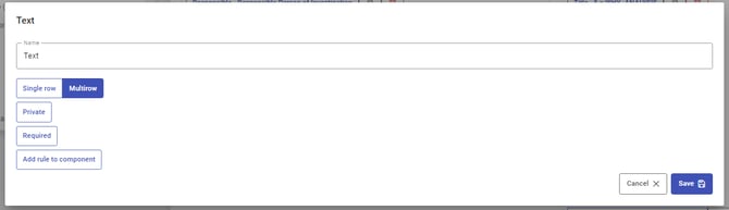
Text: Add an open text field to the tool, where the user can enter the answer during the creating phase. The text field can have two formats:
One line = forms a smaller text boxMultiple lines = forms a larger text box
The formatting does not affect the number of marks in the text box, it only affects the appearance of the text box.
Number: Add an open number field to the tool, where the person filling in the tool can enter the answer.
Date: Add date information when filling in the tool. The format of the component can be customized, it can contain a date or a date and time. In addition, today can be selected as the default for the component, which will automatically add the time of filling to the tool according to the selected formatting.
Action deadline: Sets a deadline for the task created to complete the tool. The deadline can be selected from the calendar when completing the tool.
Responsible: The component determines who is responsible for the task being formed. The component is a drop-down style menu that contains all users with ation permission.
Photo: Allows you to upload an image when filling in the tool. By tapping on the icon that appears on the tool, the filler can either add the image from the device library or take it with the camera in the Impact appversion.
Static Image: This component allows you to add an image to the tool during the building phase of the tool. This component does not allow adding an image during the creating phase of the tool.
Signature: This component can be used to add a signature to the tool during the creating phase. In the creating phase, the signature can be added by clicking on the Add Signature box, then typing the signature with the mouse or finger in the box that opens.
Counter: This component allows the + and - signs to be used to select the desired number to represent the part of the tool. For example, a checklist can be used to calculate how many things are OK and how many are not.
Checkbox: Sets a predefined button for the tool, which can be assigned a color and button text. Color options for the Checkbox and their properties:
- Green = Color only, does not generate a task or affect the index.
- Red = Color only, does not create a task or affect the index.
- Blue = Color only, does not create a task or affect the index.
- Orange = Color only, does not generate a task or affect the index.
- Task = Create task. Does not affect the index.
- Positive = Affects the index generated by the tool. Adds one positive value to the index.
- Negative = Affects the index generated by the tool. Adds one negative value to the index.
For example, a button can be set to deviation - negative, so that the button reads "deviation". In this case, clicking on it will turn it red and it will be selected on the tool.
Info text: Static text that cannot be changed during the tool fill phase. A weblink can also be placed on the component, which is visible to the person filling in the tool.
Risk matrix - Initial: The component can be used to create a risk matrix of the desired size for the tool to fill in. There is a guide on how to use this component, which you can access via the link here.
Risk matrix - Compare: The component will be added when the Risk Matrix - Initial component is added to the tool. This component uses the matrix created for the Initial as a basis. The component is specifically designed for residual risk assessment. There is a guide for using this component, which you can access via the link here.
Please find more usefull information about Risk matrix here.
File: The component can be used to add files during the fill phase of the tool. Supported file formats: gif, png, jpg, jpeg, jpe, jif, jfif, jfi, doc, docx, odt, ods, ptt, pttx, ppt, pptx, xls, xlsx, pdf, txt, mp4, avi, msg, qt, mov, m4v, eml.
User: The component allows you to select from a drop-down menu when filling in the tool which the user has been involved. In addition, a new user can also be added as a response via the component during the creating phase. The component is private by default.
Location: Allows you to use the location service when using the tool.
How to use components
During the build phase of the tool, components can be added to the tool by dragging them from the bottom panel into the tool in the desired order. For more specific information on building a form, checklist and re-updated checklist, please refer to the separate guides.
To edit the components themselves, click on the component to open it and access the editing function:
- text fields, such as name, title, button text or help text,
- and properties such as button color, add a help image or create a drop-down menu.
You can also specify whether the component is required and/or private. These are done by clicking on the box Private or/and Required. When the box turns colored, the selection is enabled, and the component is private and/or required depending on the selection.
The component can be both private and required at the same time or only one of these. Components of checklists and updatable checklists cannot be made required.
Private field data can't be displayed in analytics.
At this stage, rules can be created for the component. For more detailed instructions on how to set rules for components, see their own guide.
For some components, such as the radio button, it is possible to choose a styling for the tool Use a layout Use view suitable for long answers. For example, this option lines up the tool more nicely in radio buttons when the component texts are long.